PSV Player Popularity index & visualiser
Future Software Technologies
Semester programme:Open Learning/Innovation
Research group:Interaction Design
Project group members:Jason van de Beek
Georgi Fidanov
Moussa Adoum Moustapha
Kristiyan Lozanov
Destina Nadiroglu
Jarno Dijkmans
Project description
Main research question:
How can we design a web-based tool to help PSV consolidate and visualize player popularity metrics in a way that guides promotions, sponsorships, and recruitment decisions?
Sub-questions:
- How do match results and external events influence player popularity?
- Which players are trending at a given time?
- How can insights support talent management and fan engagement?
- What are the most effective ways to visualize time-series data and event-driven popularity shifts?
Context
The PSV Player Popularity Visualiser & Index is a collaborative project with Citric Labs and PSV. Its purpose is to transform large-scale football-related data into an accessible, meaningful visualisation for non-technical users. The system correlates players’ social media presence, on-field performance, and broader statistics such as market value. Because the dataset is both rich and dynamic, the user interface must communicate insights quickly, clearly, and interactively.
Results
Most important outcomes and their value
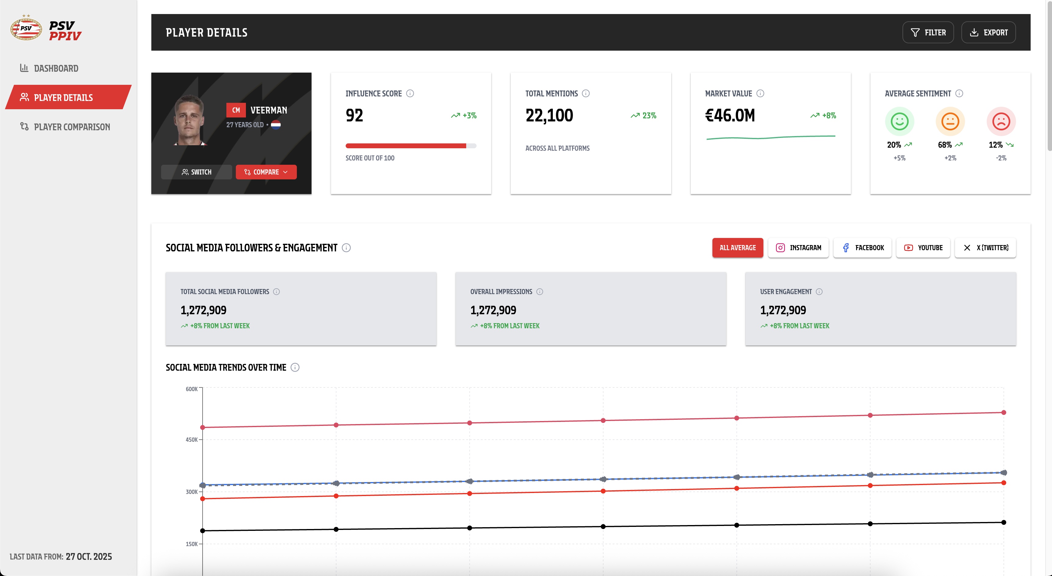
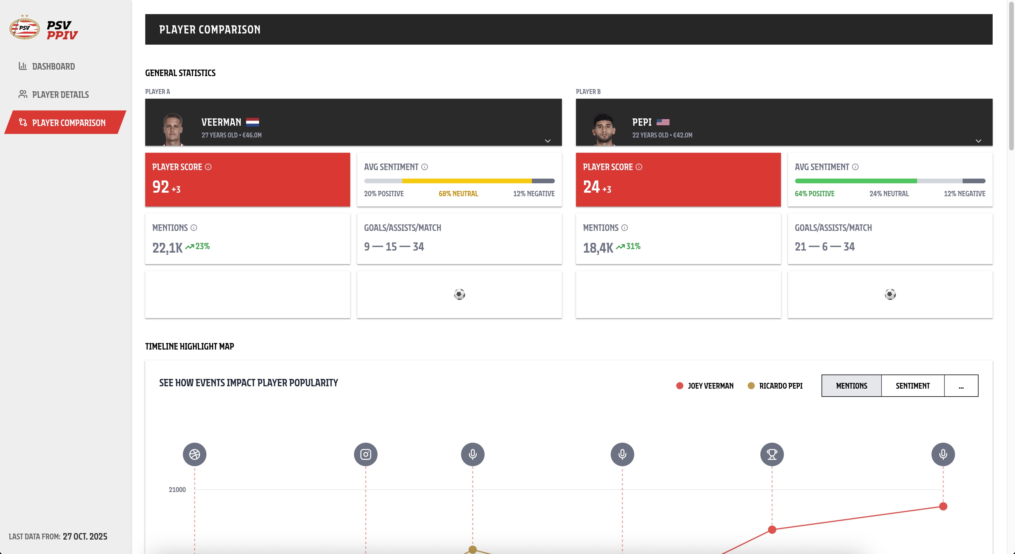
The most important outcome of this project is the Player Popularity Dashboard, a visual MVP that provides football clubs with a clear and structured overview of player popularity and related performance indicators. The dashboard is designed to give stakeholders an immediate, high-level overview of the entire club, including an overall popularity score and key statistics. From this overview, users can navigate to a player detail page for deeper insights or use a comparison page to compare players against each other. While the dashboard was initially developed for PSV, its structure and design allow it to be reused by other football clubs through rebranding, making it a scalable and transferable product.
In addition to the product itself, an important outcome is the successful structuring and interpretation of a large-scale dataset. Understanding the dataset, determining which metrics were meaningful, and translating this data into clear and usable visualisations was a complex task. This resulted in a data foundation that supports the dashboard and enables informed insights rather than raw data presentation.
Key insights gained
A major insight gained during the project was that stakeholders value clarity and visual quality over feature quantity. Early iterations showed that too much information reduced usability, while a focused set of well-chosen visualisations helped stakeholders quickly understand what is performing well and where improvements are needed. Another important insight was the importance of starting from a single, strong MVP visualisation instead of multiple fragmented views. This approach improved consistency, usability, and stakeholder alignment.
We also learned that close collaboration with stakeholders during the design process is essential. By iterating on designs in Figma and actively incorporating expert and stakeholder feedback, we were able to better understand their expectations and decision-making needs.
Validation and value
The value of the outcomes was validated through multiple feedback and iteration cycles with stakeholders and experts. Designs were reviewed and refined based on their input, which directly influenced the final structure and visual focus of the dashboard. Stakeholders confirmed that the final MVP provides a clear overview, supports decision-making, and meets their expectations regarding usability and visual quality. This validation demonstrates that the product is not only technically feasible, but also practically relevant and aligned with real stakeholder needs.
TRL positioning
Based on the level of development and validation, the project can be positioned at Technology Readiness Level 6 (TRL 6). The dashboard exists as a functional and validated MVP that has been tested and reviewed in a realistic stakeholder context. However, it has not yet been fully integrated into an operational production environment or deployed for live use, which would be required for higher TRL levels.
About the project group
Our project group consists of six students from different semesters and educational backgrounds. Three members are in semester 7, two members are in semester 3, and one member is in semester 2. Two of the semester 7 students have focused primarily on software development throughout most of their studies, while the third semester 7 student concentrated mainly on media design during an open learning semester. The two semester 3 students both have a technical background, with one of them specializing mainly in AI-related work. The semester 2 student has a strong interest in media design.
Throughout the project, we collaborated on the development of the PSV Player Popularity Dashboard. We worked closely as a team using verbal communication, Microsoft Teams, and GitHub for task management and version control. Tasks were documented and divided using GitHub, and we worked in sprints with clearly defined sprint goals. This approach helped us align expectations, distribute responsibilities, and work efficiently both individually and collectively.
The project lasted 18 weeks, of which 16 weeks were dedicated to the group project. On average, each team member spent approximately 24 hours per week working on the project. Although much of the work was done individually, we consistently aligned our efforts to deliver a cohesive and well-integrated final product. We believe this resulted in a high-quality outcome that met the expectations of the stakeholders, who were very satisfied with the final result.